Art direction
A lot of thought is being put into the aesthetics and design of this game. This is my little space to talk about it.
(If you're interested in seeing actual artwork, scroll down to the Gallery section)
Color Theory
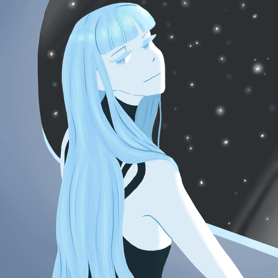
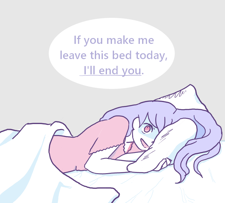
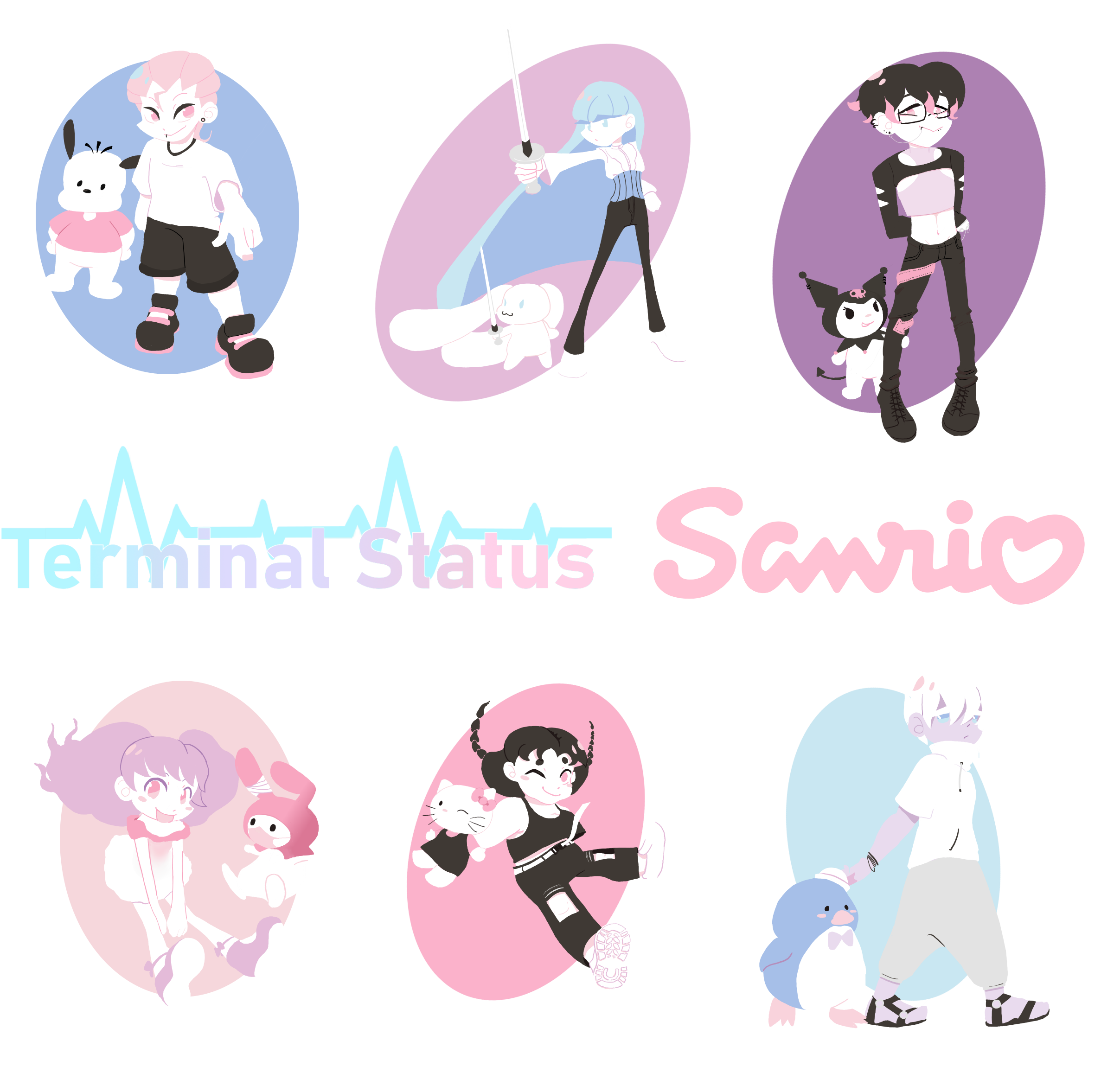
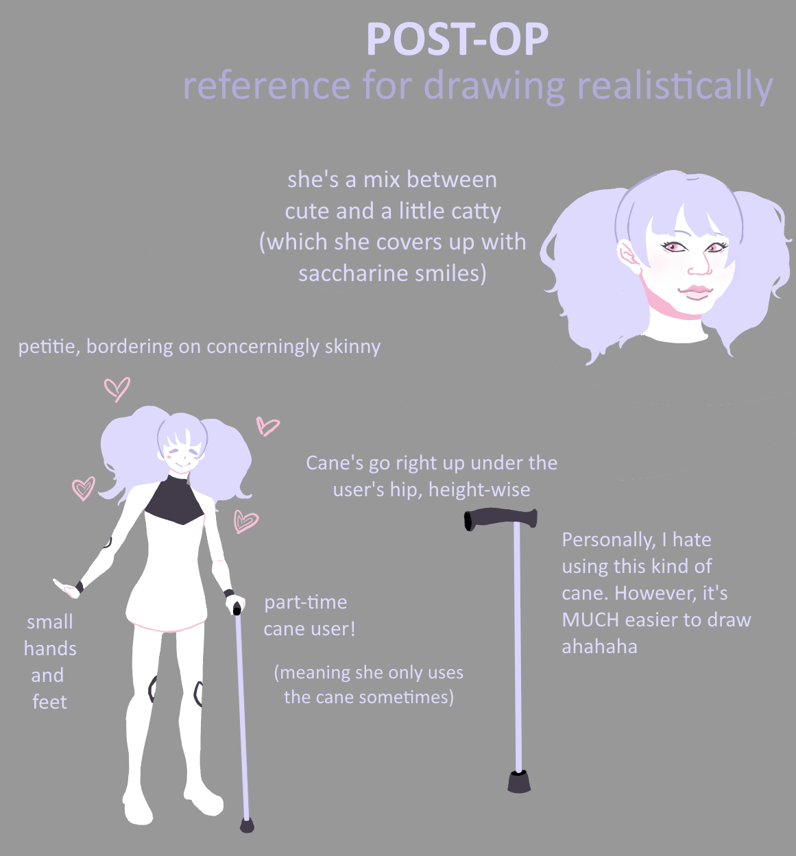
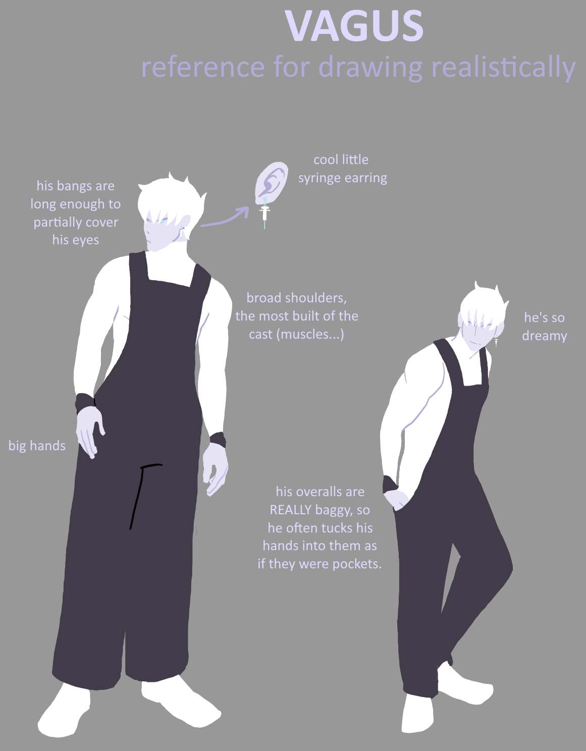
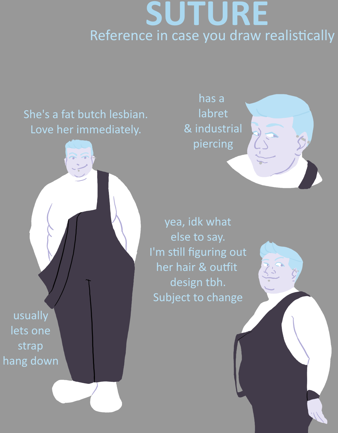
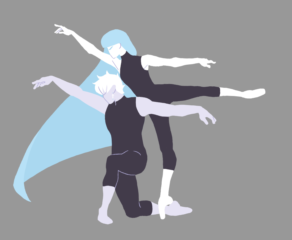
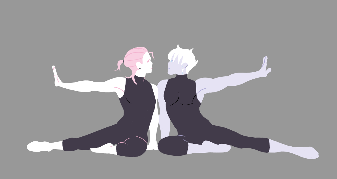
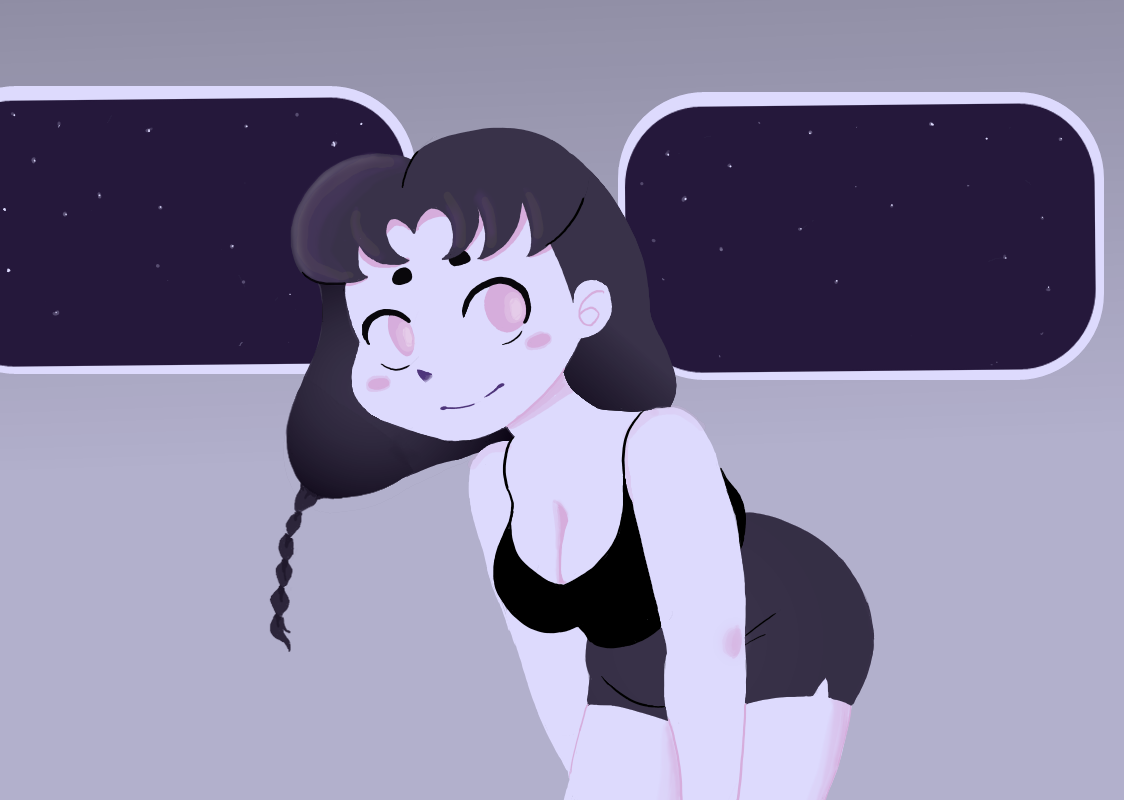
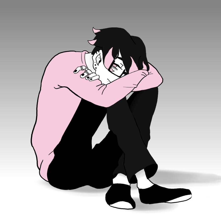
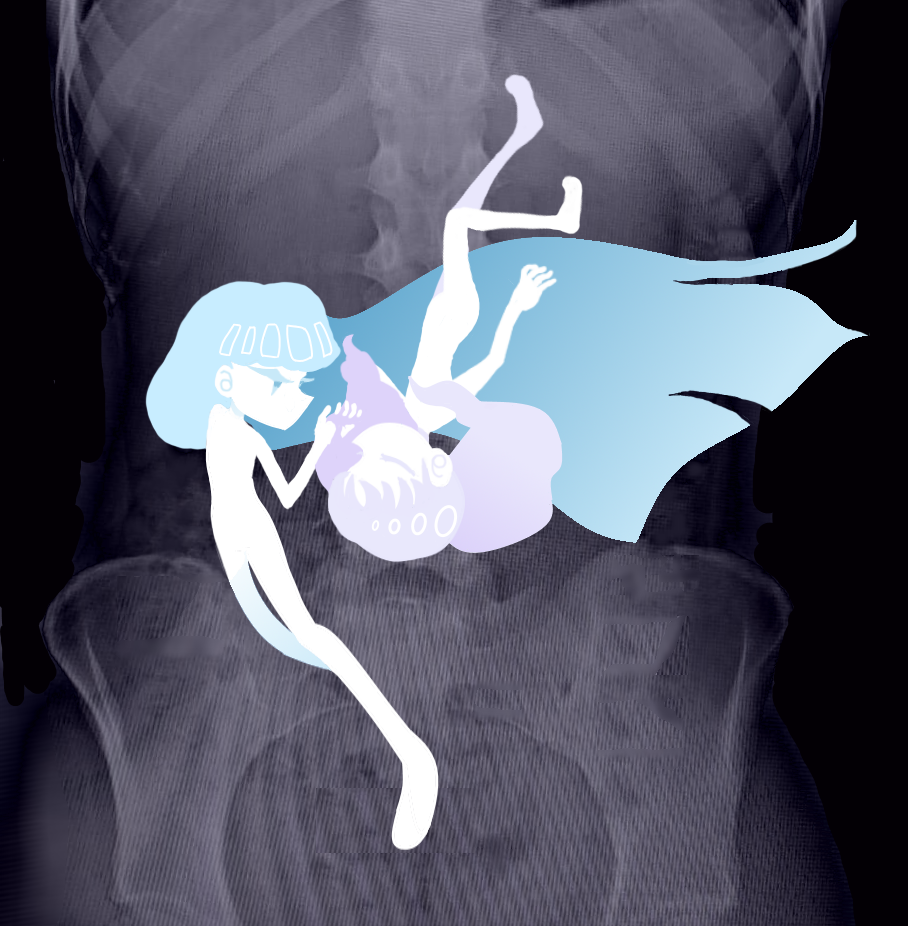
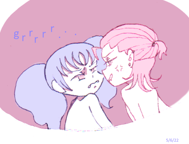
Terminal Status is being made with a limited palette, only consisting of pink, blue, lavender, and monochrome. It's a high-contrast pastel color scheme taking inspiration from menhera aesthetics.

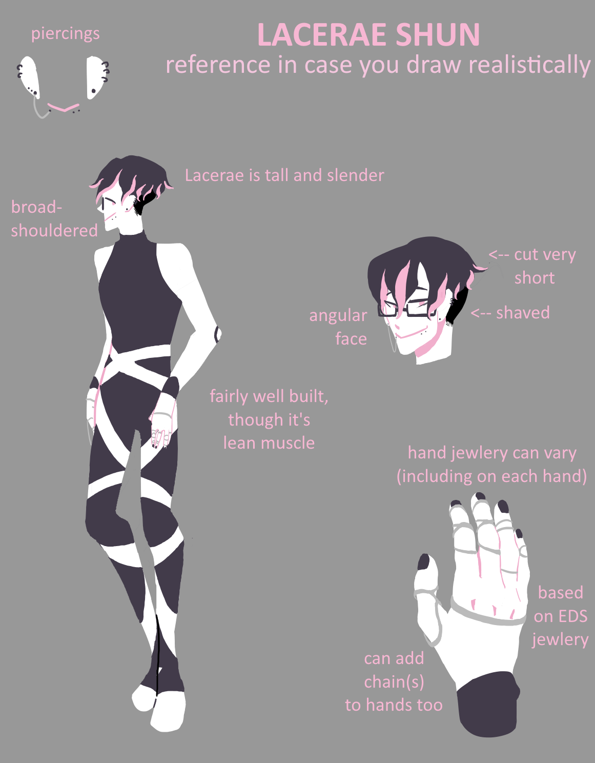
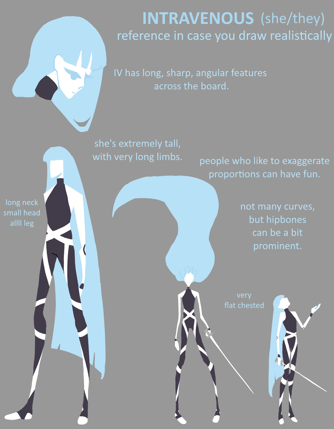
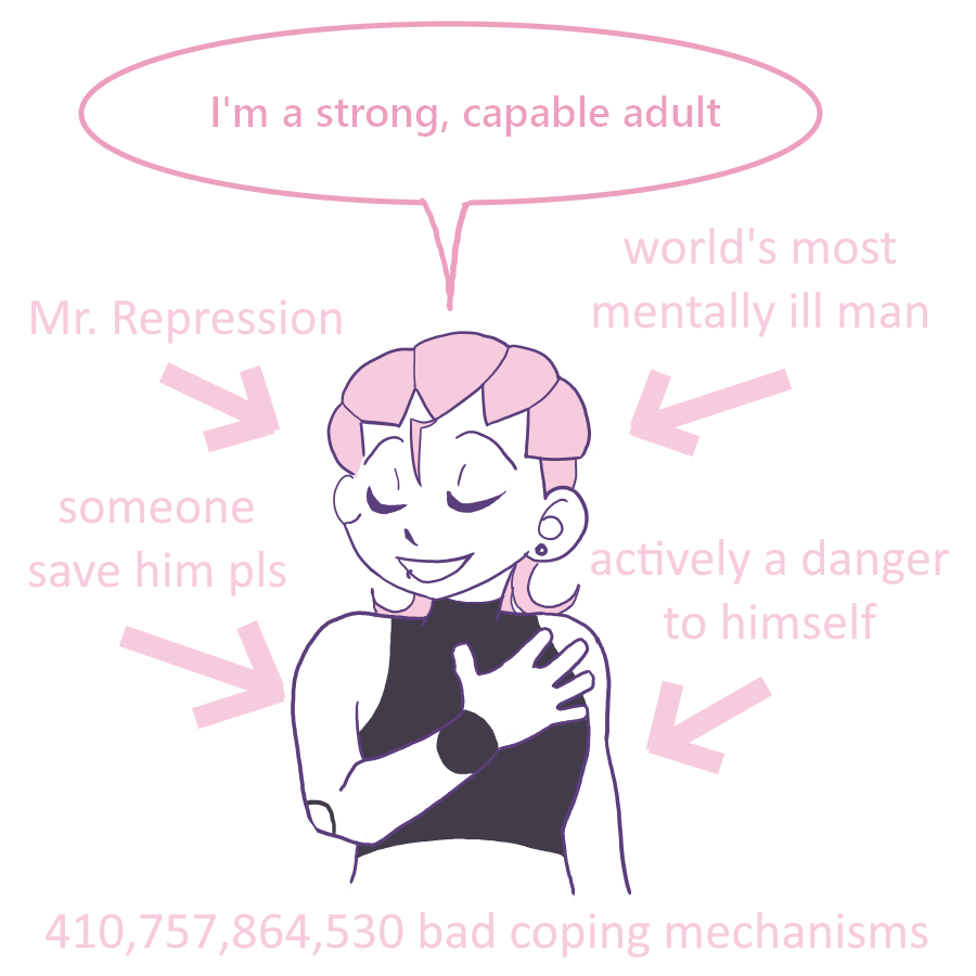
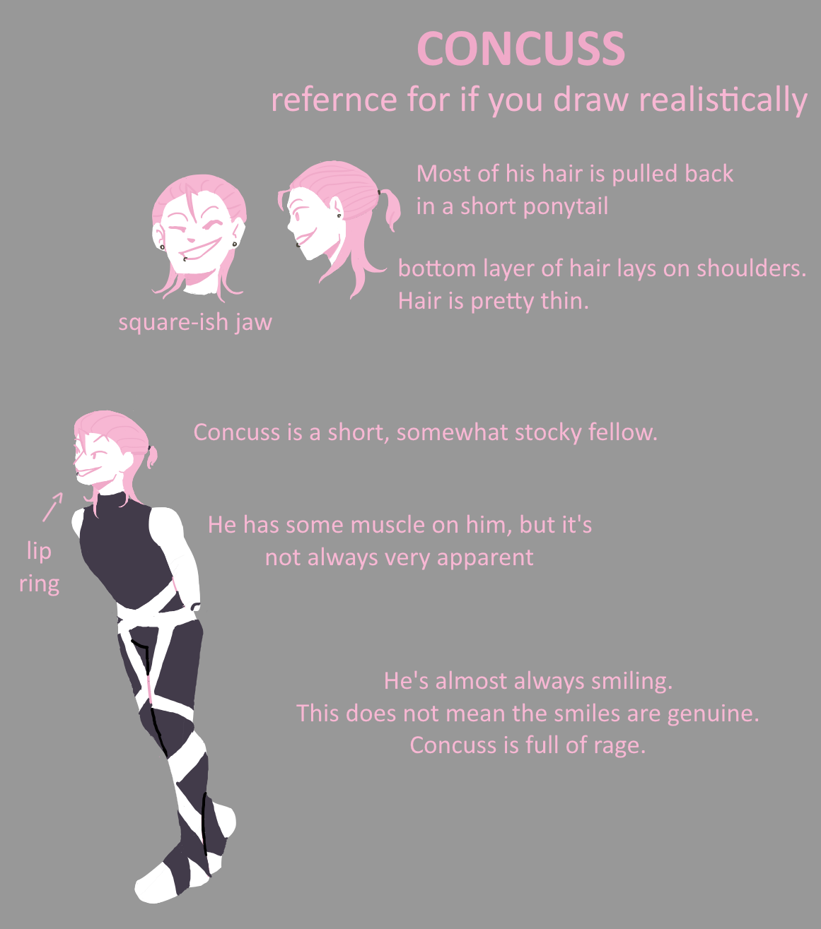
The A-plot and B-plot are also somewhat signified by color. The main trio (Concuss, Lacerae, and Viscera) are all bound together with the color pink, while the cast members most associated with the B-plot tend to be represented with cool colors like blue or lavender.
Design
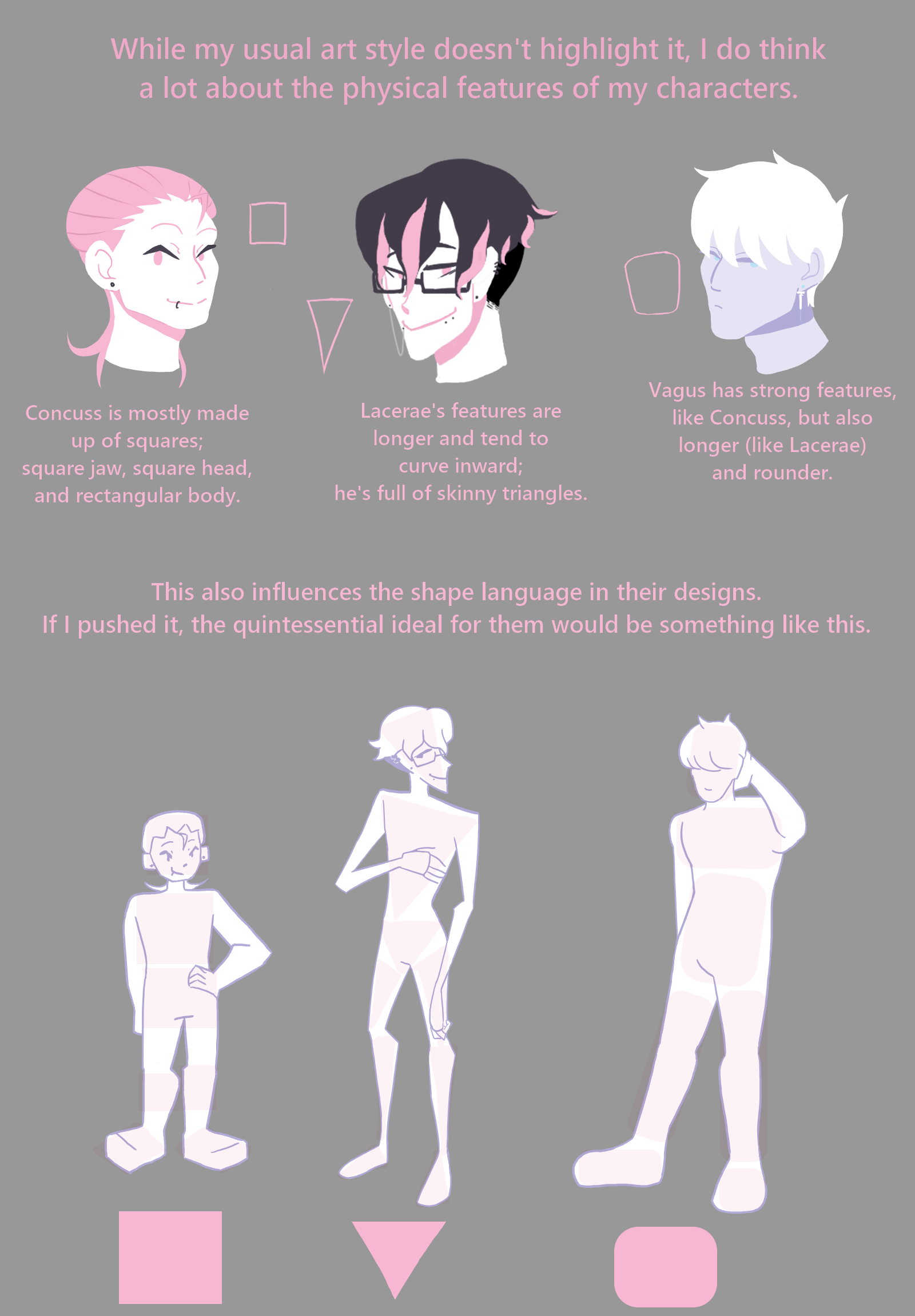
As this game is largely influenced by both menhera and disability narratives, all of the sci-fi tech is designed around medical aethetics.
Medical tech happens to be a huge passion of mine, something that only grew as my health journey had me visiting more and more clinics. As I was exposed to more mobility aids, medical tools, and machinery, I couldn't help but tie them all into my other passion: science fiction.
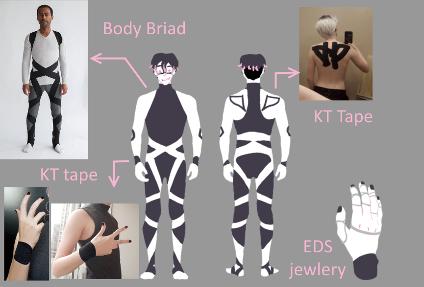
Sci-fi design, to me, works best when it doesn't closely resemble modern aesthetics. It should be a little weird, and a little alien--if society has technologically advanced to the giant robot stage of history, the trends shouldn't still be recognizable to us in the pre-giant robot times. I'm allowing medical influences to shape what that looks like.
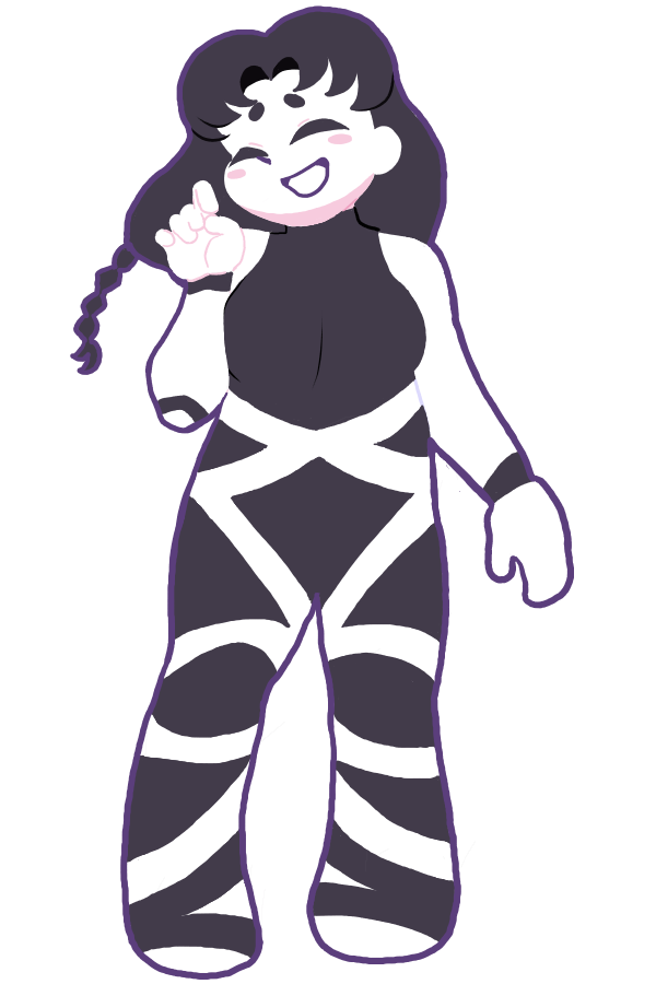
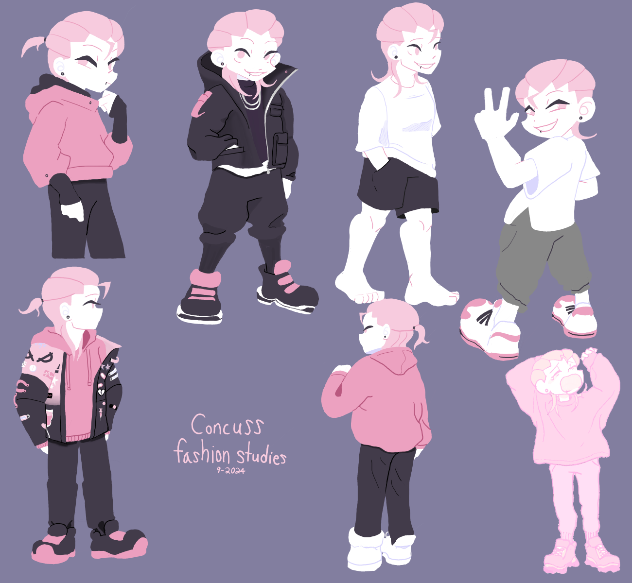
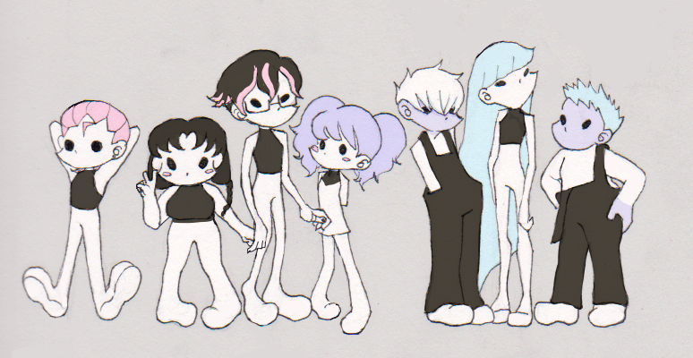
Above is an example of some of the medical influences that went into the clothing design of Terminal Status. Similar considerations are being taken for weapon design, ship design, mech design, and background art.
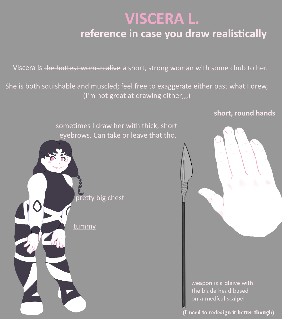
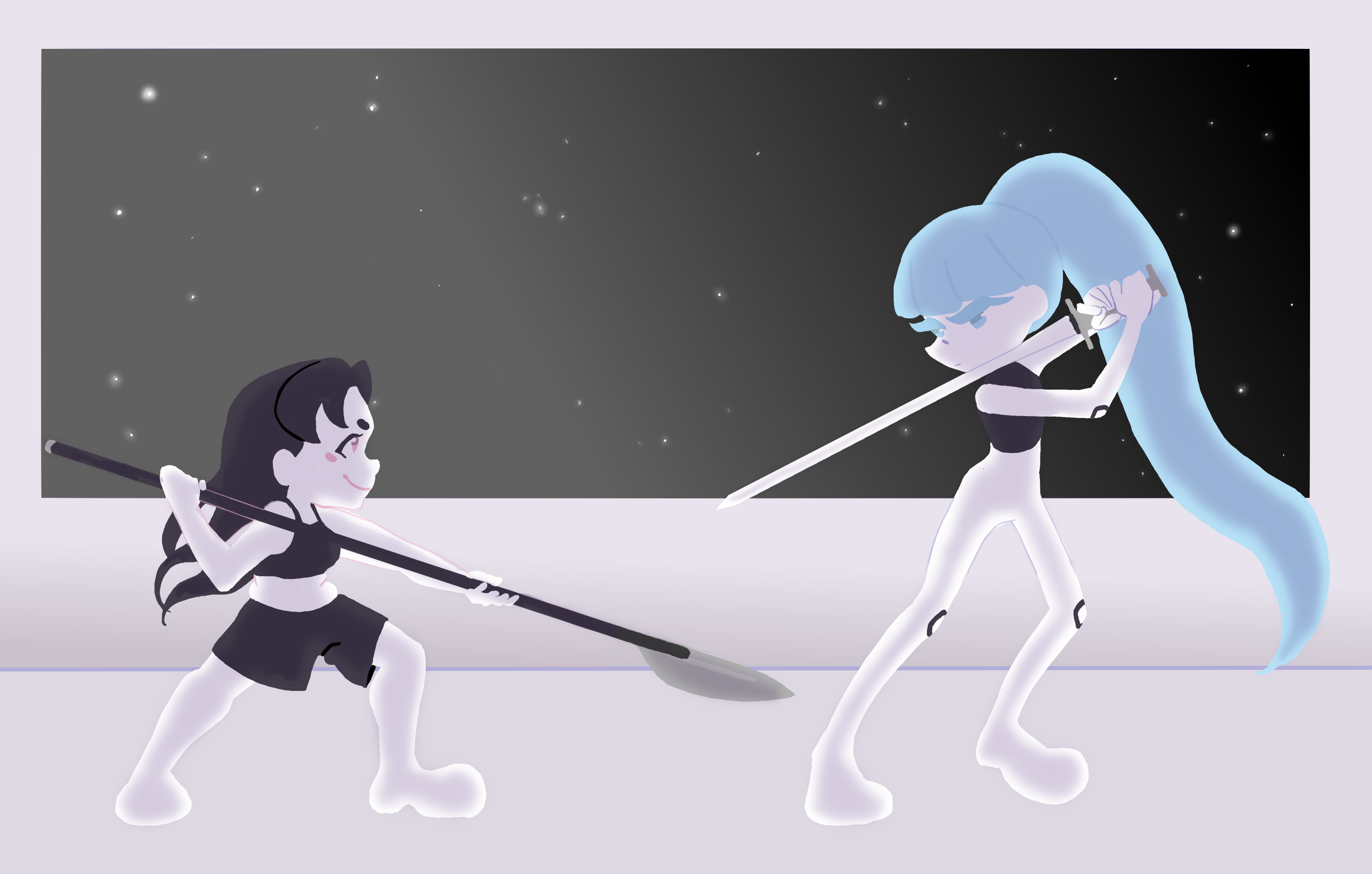
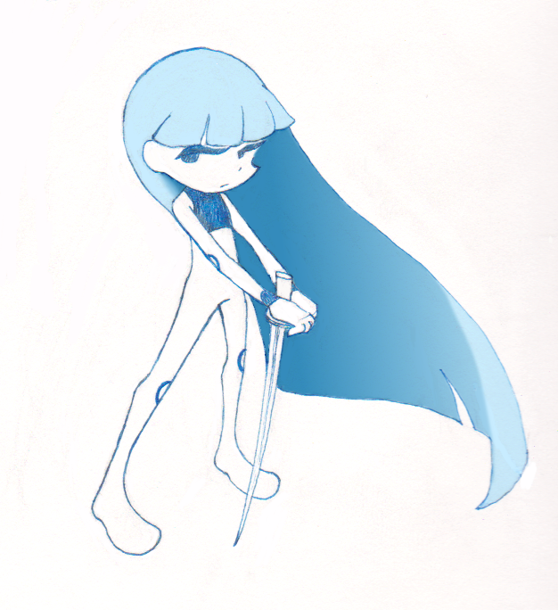
Weapons that the characters and their UMAs use are all based on medical tools. For example, a syringe sword, a scalpel glaive, hand axes inspired by reflex hammers, etc.
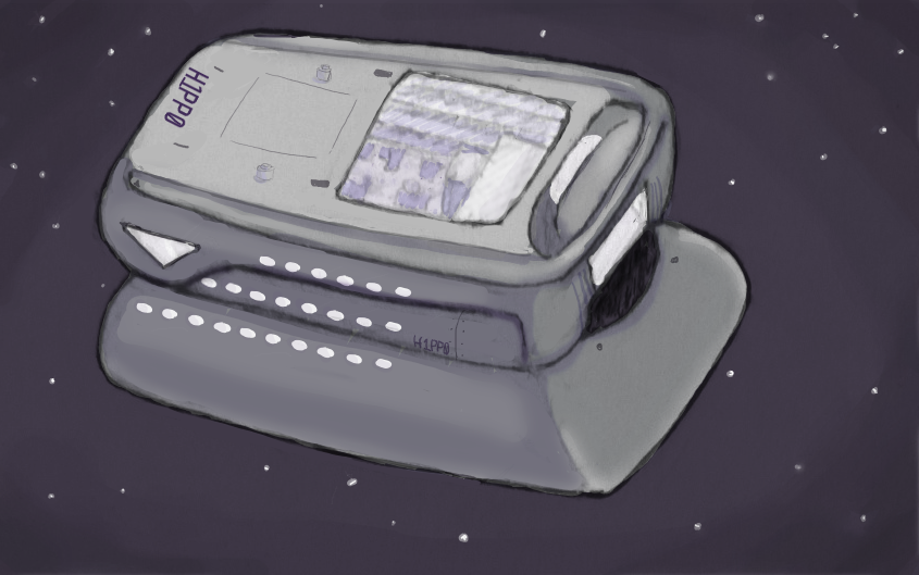
Current drafts of the H1PP0-CRAFT (which Terminal Status takes place in) are attempting to adapt an oximeter into looking like a spacecraft, while the cockpits for the UMAs will be designed similarly to various MedX machines (which simply look like deconstructed mechs to me). And there's a lot more examples I could list, but I'll leave those details to be sprinkled through the Terminal Status gamedev accounts for now.
